The Secret to Realistic Watercolor Painting
This painting started out as a sketch, but after a while I began to think it would make a good example for talking about how to paint realistically with watercolor.
In this tutorial I’ll show you the process behind the creation of this watercolor apple. I’ll also show you what you need to focus on to be able to paint more realistically, and how this can be achieved when you use watercolors.
What Makes a Painting Realistic?
I believe the key to making a painting look realistic is values.
Values are the way artists describe differences in tone ranging from the lightest value (white) all the way to the darkest tone (black).

Of course, there are many other aspects to painting such as edge control or correctly representing the proportions of the subject, but what really gives a painting “realism” is the correct interpretation of values.
Take this apple painting for example. Even though the edges are slightly rough does this really make the result look less convincing? And if the proportions are slightly wrong, would you really notice?

However, if it was painted in a way which ignores the differences in tonal value, it immediately starts to look flat and unconvincing…

Values are what allow an artist to interpret the lighting of an object, and as a result create the illusion of depth and three-dimensions on a two-dimensional surface.
How to Paint Realistically with Watercolor
You can build up a range of values in watercolor progressively, one layer at a time. Because watercolors are transparent, each layer of color contributes to the final appearance of the painting.
Each subsequent layer of paint, becomes progressively darker in tone.

This allows us to use a technique known as glazing to increase the tonal values of a painting from light to dark, and thus create a range of values which give the illusion of depth and realism.
This is the subject I chose for my painting. This photo of an apple has strong lighting which results in a high level of contrast. This is good for practicing how to judge values.

Recognizing values is a skill you can develop. Just making the effort to discern the range of values in a subject when you paint can significantly improve the realism of your work.
Value Study
Before painting this apple I started with a quick monochrome value study in pencil. This exercise helps me identify the main shapes of different values on the apple. When I’m observing the subject I try to find the shapes with significant differences in tone. Doing this in black and white is easier than starting in color.

It’s easy to see the bright white highlights and the dark black shadow shapes within the cast shadow and the form shadows. The side of the apple turned towards the light is made up of lighter tones, and as the form of the apple begins to block the light the values become gradually darker. But because the skin of the apple is very shiny you can also see a lot of reflected light on the shaded side of the apple, where the values become much lighter. (notice however that even though this reflected area looks very light compared to the shaded area, it is still relatively dark toned.
Color Mixing
Next I make a series of test mixtures to try and match the colors of the apple.
For this painting I used the following (links go to Amazon):
- Lemon Yellow – Pigment number: PY175
- Hansa Yellow Deep – Pigment number: PY65
- French Ultramarine – Pigment number: PB29
- Phthalo blue GS – Pigment number: PB15:3
- Phthalo Green BS – Pigment number: PG7
- Burnt umber – Pigment number: PBr7
- Payne’s gray – Pigment number: PB29 / PBk9

Realistic Watercolor Painting Tutorial

Try this painting for yourself ! Click the button below to download the worksheet for this painting.
step 1
We’re going to use a wet-in-wet technique for the first part of this painting. This basically means painting onto an already damp surface.
After sketching the outline of the apple onto the sheet of watercolor paper I begin by wetting the apple shape with clear water. When doing this make sure to leave the two areas of bright white highlights untouched. Remember that in watercolor painting the color white comes from the paper.
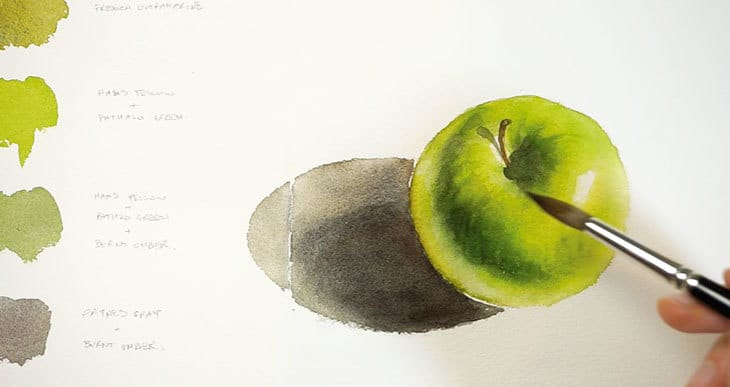
Start adding some light green to the lightest side of the apple. Then use a brighter more saturated green to add color to the areas of mid-value. I then used an olive green color on the shaded part of the apple and the side which has reflected light.
As you paint don’t hesitate to blot up some of the color if it spreads too far on the damp surface. To do this, blot your brush on a cloth and use the semi-dry brush to mop up some of the pigments.
While the surface is still damp add a more saturated color to the areas of mid-value, then use a darker neutral green to add the shadow shape on the left. Don’t forget to use your reference photo as a guide as you build up the values.
When you’ve filled in the whole of the apple leave the paint to dry. Painting the base layers using a wet-on-wet technique like this helps begin to establish the values and colors, while keeping everything soft and blended.
step 2
Before adding the next layer of color, use a clean wet brush to dampen the apple shape, again making sure not to paint over the white highlights.
Start by dropping in a bright green color into the areas of mid and dark values. Don’t paint over the brightest side of the apple on the right and the areas around the highlights and the reflected light. You want these to remain very light in value.
Use a blotted brush to lift colored pigments if needed.
Next add a dark green color to the shaded parts of the apple on the left and around the stem. The color spreads and diffuses across the surface nicely. Take advantage while the paint is still damp to charge in an even darker color to build up the darkest values of shading. Make sure your paint mixture is not too watery, or you risk diluting the underlying wash of color and causing blotches or stains.
step 3
Keep working while the paint is still damp. Blot your brush (but don’t rinse it) so that the tip is almost dry. Use the tip of the brush to tease the dark paint outward to create some texture on the surface of the apple. Try to make your brush strokes follow the spherical form of the apple.
Move on to paint the cast shadow while you leave the apple shape to dry again. Start with a warm gray color for the outer edges of the shadow, then use a darker color the closer you get to the apple (in real life this is how shadows tend to appear, they get lighter and lighter the further they are from the object casting the shadow). So to make the shadow look more convincing, charge darker colors into the right hand side and near the base of the apple.
step 4
When the paint dries I start building up the values for the shaded parts of the apple. This is painted “wet-on-dry”. In other words I added some darker brush marks and then I blended out the edges using a blotted brush.
I also added some shadow to the stalk, and increased the value of the cast shadow near the base of the apple only.
step 5
After adding some detail to the stalk I let the paint dry before repeating the process again. I added some dark valued paint to the shaded part of the core, then blended out the edges using a rinsed and blotted brush. While the surface is still damp you can see me using a similar method as before to add some lines of texture, by applying quick brush strokes to push some of the dark paint outwards.
Use the same method for the shaded side of the apple. Apply some brush marks of dark paint, blur out the edges using a blending technique, then use the tip of a dry brush to push the colored pigments around on the surface. Because the paper is damp this produces some nice soft lines of texture.

You’ll notice that your painting appears lighter each time the paint dries. This is a typical characteristic of watercolor paints. Just keep building up layers of paint until you’re happy with the values. For example, here you can see me deepening the tonal value of the shadow with another layer of warm gray.
Don’t forget to intensify the cast shadow of the stalk if needed.
step 6
At this point I decided that the overall color was slightly dull, so to brighten up the green hue of the apple I added a few brush strokes of cool yellow. The combined effect of the underlying color plus the new glaze of yellow helps to brighten up the final color appearance.
step 7
The apple is almost complete apart from a couple of finishing touches. In the original reference photo you can see the apple is covered in light colored freckles.
To achieve this I used a lifting technique to remove some of the paint. Using a small stiff brush dampened with water I’m scrubbing the surface and blotting up the loosened pigments using a clean paper tissue.
step 8
Similarly, there are a few areas around the edges of the apple which need lightening in tone. For this I used a damp cotton swab to rub the surface and remove some of the color. Don’t overdo this or you can damage the surface of the paper.

And here’s the finished result…

Next time you try a watercolor painting, try to push yourself to find the correct range of values. You should find this will help create a more realistic representation of your subject.

Hi Anthony,
Your instructions are so detailed and precise. Have you ever considered doing the same thing through youtube? Seeing you paint and mix colors would be so helpful. I hope you will consider it. Thanks.
Hi Susie
I started a Youtube channel not long ago 🙂
You’ll find it here:
https://www.youtube.com/c/AnthonyWatercolorAffair
I would love to share with you the results of your amazing lesson!!! I can’t believe I painted those apples and a pear by myself!!!! …your YouTube channel is great and I love the step by step instructions that I receive in my email, I am a big fan of yours, big hugs from Chile .
Hi Alexa !
send me an email anytime !
Hi Anthony, This tutorial inspired me to create a sketch book and go back to your first blog tutorials and work with your instruction to the most current. While I understand the need to find support for your work, I would be willing to bet there are those of us that are huge fans of yours that would be willing to join a crowd funding page if you created one. The biggest incentive for me would be to be able to work through your blog posts “add free”. Just a thought.
Hi Cathie
keeping a sketchbook is a great idea – it’ll help you review your skills over time, and it’s just such a good habit 🙂
I understand your frustration with the ads – I don’t like them myself. In fact the settings are on a minimum (can you believe people put even more ads !!)
The idea of a member site is something I’ve considered… but I’m not sure how many people would actually want this…
I would also want to give members extra value (additional videos, tutorials etc.) So I’ll need to create the content !!
Should keep me busy for a while !
I am glad to hear this! During these strange times, artists like yourself have been so instrumental in providing outlets of expression. I look forward to what you present.
🙂
Thankyou so much for all your tutorials, they are SO helpful!
I’m new to painting and I’ve learned so much from them.
Hi Anthony:
Why did you decide to do wet on wet instead of wet on dry?
Did you paint with paper flat on the table or tilted?
Thanks
Normi
Hi Normi
When you paint wet-on-wet you have more time to move the colored pigments around and you get a smoother blend of colors. if you paint wet-on-dry you have to be quick to blend before the paint dries, otherwise you get streaks and brush marks.
The painting was done on a flat board. i only tilt the board when I have a large wash of color and i want to use gravity to more the pigments around.
I appreciate the detailed techniques you provide for free. Thank you.
Thanks, I will try this! I was already working on apples.
Thank you so much for this tutorial! Your tutorials are the best – they simplify the process enough to make it seem achievable for a beginner while the result is realistic without becoming stiff with perfectionism. Just the balance I hope to achieve with practice. Thanks!
I really like your instructions. Ive learned a lot especially about color theory. I enjoy all your lessons. You have kept me inspired to keep painting.
Nice of you to say Tricia
I’ll try to keep you inspired 🙂
Hi, What do mean by a small stiff brush.
Thanks
Susan
Hi Susan
I used a small synthetic brush for this project. Synthetic fibers are harder than natural hair so they allow you to “scrub” the surface for better lifting. You could also use a very small bristle brush for this.
cheers !
I really appreciate your detailed instructions!
Thanks Gunilla !
Glad to help…